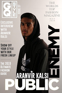
Magazine cover learner response
1)
Add your finished magazine cover as a JPEG image.
2)
Type up your feedback from your teacher. If you've received this by email, you
can copy and paste it across - WWW and EBIs.
Mark: 11
Grade: B
WWW: In many ways this is
an A grade cover – it immediately looks professional, sits well between two
real GQ Style covers and has an excellent harmonious page design. The cover
image is strong, direct address from the model’s eye contact is absolutely
appropriate and the left-hand side cover lines are very good. In addition, your
evaluation is quite detailed and reflective and these will be valuable skills
when it comes to acting on feedback for the real coursework next year. There
are just two key aspects holding this back…
EBI: The big lesson here
will be extremely useful for the coursework next year – read the brief! Your
‘Public Enemy’ main flash is identical to a real GQ Style cover and the brief
states that you need to come up with original cover lines and content.
Secondly, the text in the top right hand corner holds this back from
professional standards – the font doesn’t match the ultra-modern, urban feel of
the rest of the cover (why a serif font there?) and you are missing an
apostrophe on ‘World’s top fashion magazine’. This is a great lesson in the
level of attention to detail and professional finish we need in the coursework
next year!
3)
Consider your mark against the mark scheme above. What are the strengths of
your production based on the the mark scheme? Think about magazine cover conventions and
the media language techniques you have used to communicate with your audience
(e.g. mise-en-scene, camera shot etc.)
4)
Look at the mark scheme again. What can you do to move your mark higher and, if
required, move up a level?
5)
What would be one piece of advice you would give a student
about to start the same magazine cover project you have just completed?
I would say to most definitely make sure to stick to the brief throughout the whole thing as if you use aspects from another magazine directly you will lose out on silly marks. Also make sure to make it as professional as possible so that the examiner can clearly see you took time with it and have a clear understanding of media products.

Comments
Post a Comment